Interview with the designer of Wall-E
Comments Off on Interview with the designer of Wall-E | Culture+Politics
Comments Off on Interview with the designer of Wall-E | Culture+Politics
If you’ve been to youtube lately (or… ever), you have probably noticed evidence of the over-population of Windows Movie Maker users, eager to show off their madskills at generating white text on a blue background with their favorite to 90’s track pumping. Advanced users will also add real, full-color photographs with transitions such as wipe and crossfades.
For people who are playing with video editing software for the first time, this is great. They can throw something together and upload it to YouTube in a few minutes, and gain some sense of accomplishment without having to do anything overly technical.
For people who are on YouTube looking for an actual video (which I assume is all or most users), this is just awful. I’ll go out on a limb and assume that most people searching for something on YouTube are not overly critical, they will tolerate mediocre-quality video and amateurish production – that is the whole appeal, but it is fair to assume that these people are, at the very least, looking for video. Not slideshows.
And you can’t blame the MovieMakers. Making slideshows is easy, and fun. But what I cannot fathom is how YouTube has fostered the growth of this truly unwelcome phenomena on their service. If I am searching for an eagle attacking a wolf, I would expect, at the very least, to see an eagle attacking a wolf, not a handfull of photographs someone found of the same, with a cheezy hip-hop midi in the background.
Considering all of the energy Google has devoted to identifying copyright-protected content in YouTube, you would think they could use some of that same mojo for at least identifying what content is actually a video. How many “videos” for example, are there out there, that are just a still image with a full-length copyright song? Come on!
The technology required to identify slideshows and still images is pretty basic. This could be implemented where the user uploads a video. They could tick off a radio button that identifies the content as “full motion video” or “slideshow”. Viewers could also flag content as a slideshow when the creator does not. And furthermore, the video itself could be analyzed, either when it is uploaded, or on a random / periodic basis, to determine if there is motion from one frame to the next. Really, there is no excuse for them to leave all these slideshows “in the soup” of a site intended for video.
All it takes is a little “Mark as slideshow” link, like this:

Comments Off on Slideshow Predation on YouTube | Interface Design, Rants, Service, Software, Video

All you mac users know what I am talking about. The fucking beachball. Along with preemptive multitasking (thank god), one of the advancements OSX brought us over OS9, was the upgrade from the bitmapped wristwatch icon to the 24-bit glossy beachball of doom.
The OSX beachball could represent one of the greatest failures in the history of Apple, who single-handedly put the “personal” into “personal computer, and set the benchmark for user-friendliness. For starters, new users are given no explanation about the meaning of the beachball, either implicitly or explicitly. The pre-OSX wristwatch at least gave us a sense that we need to wait a moment. Instead, uninitiated users have to guess what it means, or search google.
Searching apple’s own website does not give any explanation for the beachball, probably because they don’t call it the beachball. Buried deep inside their Human Interface Guidelines documentation is the following:
The spinning wait cursor (see Figure 12-1) is displayed automatically by the window server when an application cannot handle all of the events it receives. If an application does not respond for about 2 to 4 seconds, the spinning wait cursor appears. You should try to avoid situations in your application in which the spinning wait cursor will be displayed. The Spin Control application provided with Xcode can help you eliminate code that is causing this cursor.
Figure 12-1 Spinning wait cursor
Well, thanks Apple, for clearing that up. Now when I see that beautiful spinning tie-die beachball thingy, I will know that the application cannot handle all the events it receives.
I will credit Apple for at least advising developers to find ways to avoid this cursor from appearing, but it still does, a lot. Especially for a power-user who has lots of apps going at once. But would it kill them to look for an alternate representation of an application being unresponsive? Here is a simple suggestion – maybe they can mull this over at apple for the next decade or two, while they are putting the final polishes on 10.7:
The whole application window(s) would “grey out” with a large white clock icon in the centre (similar style to the volume indicator), with a message that says “Application is busy” followed by a timer indicating how many minuter/seconds have elapsed. When the timer reaches a specified threshold, say 5 minutes, a message will appear that says “This application has become unresponsive, click force-quit to force this application to quit, or relaunch to relaunch the application”. The timer would continue until the user makes a selection… Like this:

Until then, those of us who need a way to vent our frustrations with this beachball can visit marbleofdoom.com and indicate how long they have been waiting for the beachball to stop. The time feeds into a group timer indicating the total time all visitors have spent watching the beachball.
Comments Off on Just a sec. No wait. Just a minute. No wait. I’ll be right back. Probably. | Interface Design, Rants, Software
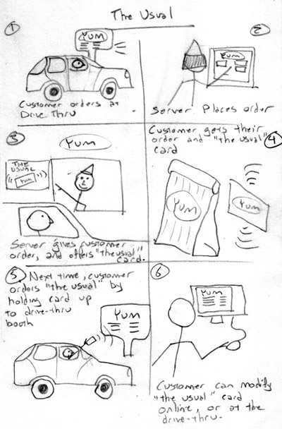
I would be shocked if some coffee or fast food chain somewhere is not already about to launch this. The drive-thru experience can often be such a downer, people (at least some I know) will sometimes prefer to park their car and go inside for more humane service. I am still fond of old-school-walk-in-and-talk-to-a-human style service, but that seems to be getting phased out more and more in favor of drive-thrus that translate both your voice and the servers voice into klingon with a distortion pedal and a 4khz bitrate.
So let’s put an end to that nonsense. Combine a drive-thru workflow with RFID technology and customer profiling, so that customers can keep their most commonly made order on file. It works like this:
There are a variety of ways this can be implemented. For example, a customer could keep a few cards on hand for a few different orders. Another option would be to link the RFID card to a touchscreen-style drivethru, so customers could place the initial order on the touchscreen, and then subsequent orders could be made with one-click when their order history is shown on the touch screen.
Many fast-food chains are already implementing RFID cards for quick payment. Given that each card would already have a unique ID attached to them, it might not be such a stretch to use this unique ID to store customer preferences, if the customer wishes to.
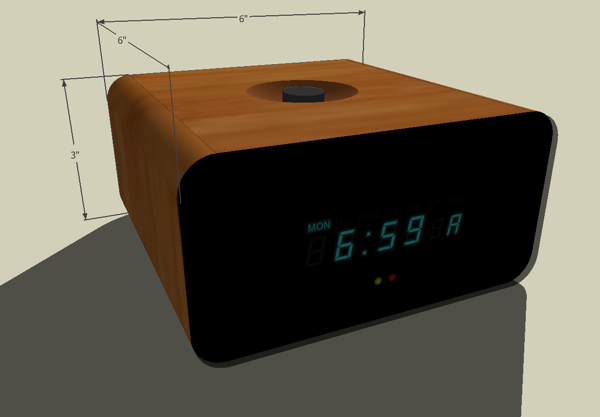
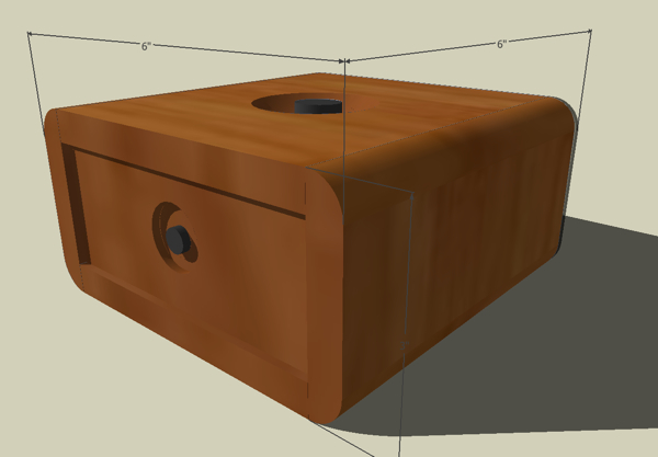
I’m making a few minor updates to the clock design, specifically for the prototype. I’m not as fond of this shape, it’s now 3″ high instead of 2″, not as sleek, but this initial prototype is more about getting everything functional, and will allow more room for error when fitting all the electronics in. Once we have all the components in there, we can see about shrinking it down.
There are now two knobs instead of one. The one on the top will be for alarm functions, and the one on the back will be for time functions. In many hardware interface designs we see instances where many controls can be accessed from a single point, in this case a knob. The downfall in that approach is that you end up lumping together the more commonly-used functions with the less commonly-used. So for example, if most of the time people just want to adjust the alarm time, but they end up paging through the current time, date, etc…, it becomes more cumbersome than it needs to be.
With a single rotary encoder, there is no “back” button, so the user cannot page back if they accidentally skip over the function they want, so they have to click several times to come back to the page they meant to be on. So by having one knob for the alarm, and one for the time, the user will have to do less paging, and they will be less likely to make any mistakes, such as changing the current time.
Comments Off on Updated clock prototype sketch | Alarm Clock Project, Electronics, Hardware
Make: television Preview – Music Machines from make magazine on Vimeo.
This is me when I retire.
Comments Off on Music Machines | Electronics, Hardware, Video
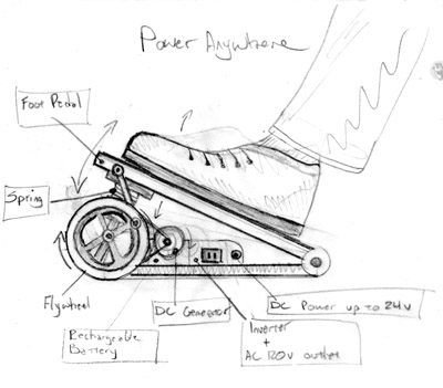
How many people do you know who bounce a knee under their desk all day? Many people who work at a computer for most of the day have energy to burn, and nowhere to burn it. meanwhile, road-warriors often have to scramble for power when they realize their laptop is running out of power.
The concept of using human power to supply energy to electronics devices is not new, however most implementations out there lack one key thing for portable electronics: portability. Resembling a wa-wa pedal, PowerAnywhere is a small, foldable, foot-powered generator that works on a similar principle as old-fashioned singer sewing machines. The foot motion is transferred to a flywheel, which then drives a DC generator, which is then connected to a rechargeable battery. When the bettery has sufficient charge, it will supply standard AC 120v household current by way of an inverter, or a DC-powered device up to 24v.
The device could generate power for a variety of electronics with, like iPods, mobile phones, laptops, etc… As this is powered by only one foot, the generator alone may not provide enough power to keep the average laptop going. Rather, the user would try to keep the charge topped up throughout the day, and use it only when needed. For example, it may sit under the desk being charged for 2-3 hours, but only provide an hour’s worth of power for a power-hungry laptop.
The user could generate power in a variety of ways. Some might push with their heel, others with their toe. To build up a charge more quickly, someone might stand up and bounce on it with one foot for a few minutes. The device would ideally be foldable, and fit easily inside a suitcase, briefcase, laptop case, or carry by hand. It could also have an option to snap on to the back of your bike to generate power while you coast down hill.
Comments Off on Power Anywhere | Inventions
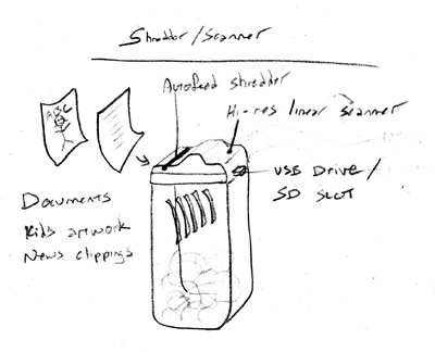
I’ve been thinking about this one for a while… A household shredder that scans at the same time. Used to archive memorabilia such as children’s artwork, new clippings, etc… without having to find appropriate places to store them.
It would accept paper up to 24″ wide, with varying thicknesses, so it could accommodate all sorts of messy mixed-media hand-painted creations. The shredder would viciously tear apart these treasures in seconds, but keep them preserved with care via an SD card, with an internal memory backup just in case. A USB jack would enable the shredder to be connected to a PC for quick download of memory contents. The shredder would not function unless the memory card was in place, so nothing could be shreeded unintentionally.
Shredding would be slower than other shredders, to allow time for scanning. Scanning mechanism would be similar to that of a fax machine, with a high-res color CCD. The mechanism would need to be designed to grip the artwork and carry it through the scanner steadily, and able to maintain focus on crumpled, torn, or messy pieces of art, with internal self-cleaning cycles to wipe away paper bits, glitter, macaroni noodles, etc…
Color-coded buttons at the top could be used to assigned custom tags to the item being scanned, so “green” might be kid’s artwork, and “blue” might be news clippings, etc…
The “What is a switch?” project is a Tellart classic.
It takes the form of a workshop or a longer course, and, by using low-cost materials and familiar design tools, is meant to demystify electronics for design students and artists – expanding their conception of what it means to design with embedded electronics.
Comments Off on What is a Switch? | Electronics, Hardware, Video

Obama has made a name for himself as the most media-savvy president in history. He has also earned his reputation for his ability to deliver a message with clarity and impact. Obama further cemented his reputation last week beginning his first in a series of weekly TV addresses, available on whitehouse.gov to view as an embedded youtube video, or as an mp4 download in full 1280×720 high definition wonder, so web audiences worldwide can now receive the leader of the free world’s message fully and clearly, with each freckle, creeping stubble, errant eyebrow and stray hair for the world to see.
I wasn’t surprised when this week, the weekly address was posted at a slightly more modest resolution of 720×404, and changes in the lighting. The president was looking like he could use some sleep… understandably, with the mess he has to deal with, but it makes one wonder if he got his implant yet. No news of falling down after choking on a prezel yet, but we’ll stay tuned. For now, one thing is certain, Obama’s media team and make-up artists are hard at work.
Comments Off on The pros and cons of high-definition | Culture+Politics, Video